When creating Canvas Apps I always spend allot of time creating navigation. This is for me the most used component that I add into every application – I mean everyone needs to navigate surely?
When I first started using Power Apps I started off using icons and labels grouped together with Navigate() commands on the OnSelect property. This worked well but soon became unmanageable when trying to add additional screens to the application. This is because in each screen it was used it required updating.
After a few months I then started using Galleries and Collections to create a navigation control. This worked better as adding a new screen would be dynamic based on the collection (this is shown below). However, if a requirement came in to change the colour of look and feel of the gallery this would require updating the gallery on each screen.
Now I use Power Apps components. This allows a centrally managed component to be used to control the navigation. If an update occurs to the gallery to change a font colour this is reflected in every use of the component across the application.
To reduce the time in creating, maintaining and editing these sections I do a few things:
- Create a Power Apps component
- Power Apps components are still in preview but for these applications they reduce the development time of applications, make application maintenance / changes an awful lot easier and can be shared with other Power Apps
- Create a collection to store the navigation ‘configuration‘
What do you need?
All you need to follow this demo along is the ability to create a Power App. To create a Power App:
- Navigate to https://make.powerapps.com.
- Select ‘Apps’ from the left hand navigation
- Select ‘New Apps’ > Canvas app from the top navigation items
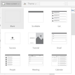
- Select Blank App and select the form factor (tablet or mobile) you wish to create the component navigation / header from
Creating the Component
This is the FUN part now as we get to create the components!
Step 1 – Creating a collection of navigation items
Step 1a – Creating the screens to navigate to
The first step would be to create a few screens so that we can set up a collection to control the navigation. In this example the screens that we have created are called ‘Search Accounts’ and ‘Add Account’.
Creation of screen 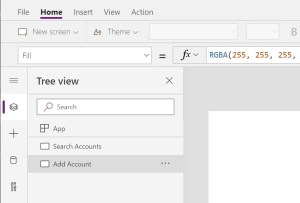
List of screens in app
Once the screen has been created this should be renamed to ‘Add Account’. This will be the property needed in the collection to control the navigation of items.
Step 1b – Creation of collection
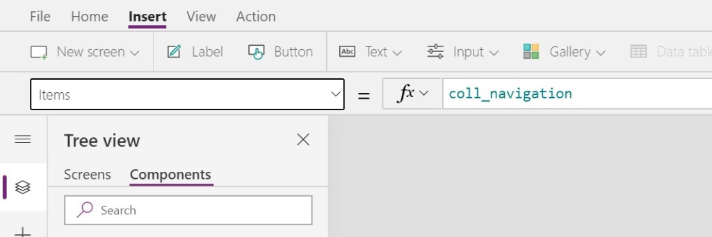
The component that we create for navigation will be based on a collection that we initialise on the start of the application. Each item in the collection will contain a few different items:
- Screen – this is the screen that will be navigated to. This is actually the screen object and not just a text value.
- VisualTitle – this is the title that a user will see in the navigation component
- Icon – the icon or image that will be visible for the user. This should have relation to what the screen is attempting to show / complete. For example a screen that will add items could have the Icon.New icon displayed.
The OnStart can be found on the properties for the App. In the function bar for the property a collection needs to be created:
ClearCollect(
    coll_navigation,
    {
        visualTitle: "Search Accounts",
        icon: Icon.Add,
        screen: 'Add Account'
    },
    {
        visualTitle: "Add Accounts",
        icon: Icon.Add,
        screen: 'Add Account'
    }
)

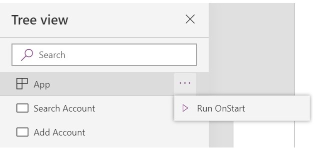
Now when the application runs this collection will be created because of the OnStart. If you need to get this to run in the Portal then you have to select the three ellipses next to the App and select run OnStart.
After you have run the OnStart command select View > Collections in the top ribbon. This will open all the collections that you have in the application and you should see a collection called coll_navigation. To add more items to the collection edit the object by adding another set of {} brackets with the correct content.
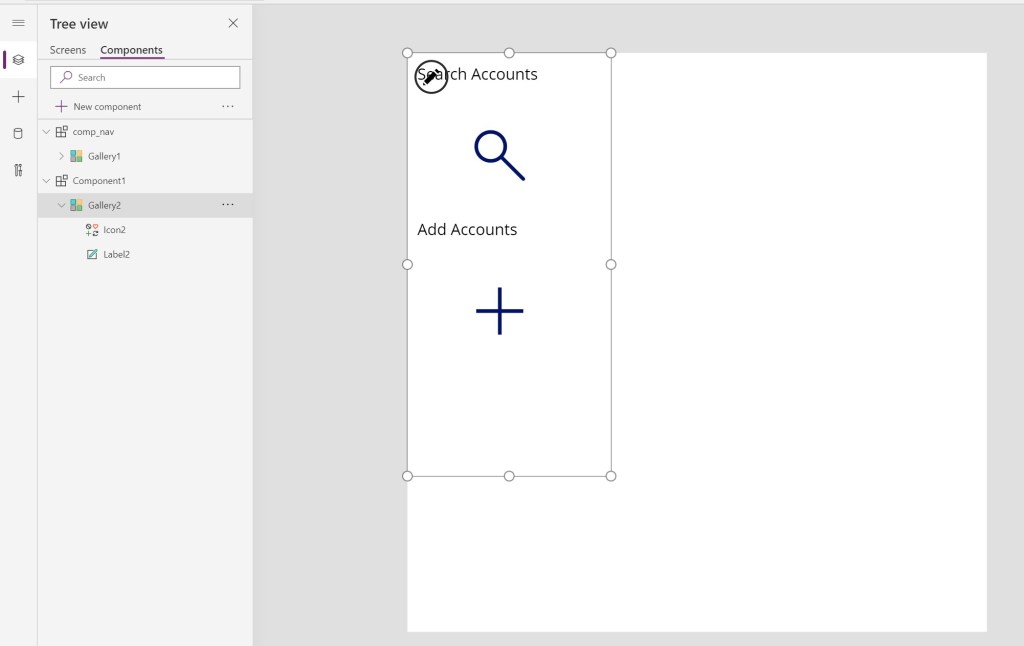
Step 2 – Enabling Components
To create useable components we have to enable a feature in canvas apps. This feature can be found in “file > settings > advanced settings > Components”
Once this setting is enabled when navigating to the screens in the application you should see a Components section next to the Screens section.

Step 2a – Creation of a component
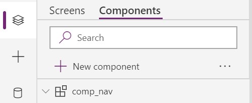
After components have been enabled lets go and create one. Select the tab ‘Components’ and add component.
Rename the component to represent what it is. In this example I’ll call it comp_nav.
In the canvas that has been added as part of the component we need to insert a gallery onto it. This gallery will be used to show the collection created earlier. To set the gallery data source select the gallery and update the data source to the collection.
Remember to run the OnStart command on the application otherwise the collection won’t have been initialized.
I add an empty vertical gallery. If you want the navigation to be horizontal then add a horizontal gallery.
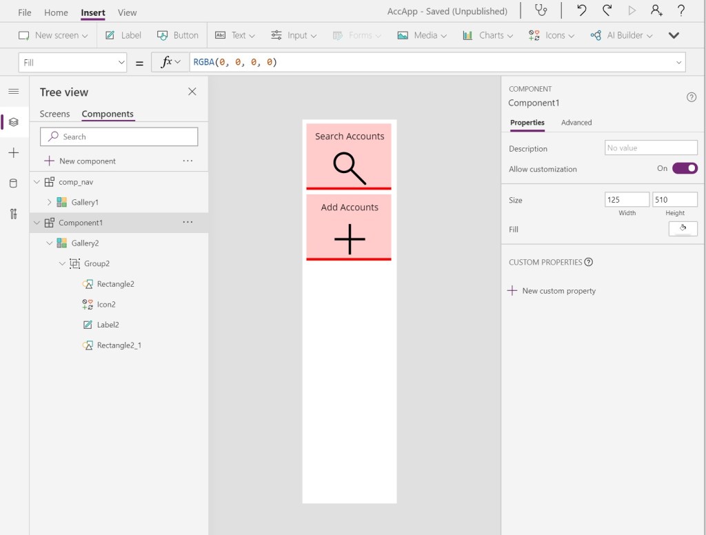
I apply the following settings to the gallery:
| Property | Value |
| Scrollbar visible | false |
| Accessible Label | Navigation component for the application |
| Color | black (0,0,0,1) |
- Scrollbar – false
- Accessible Label – Navigation component for the application
Once the gallery has been configured a little I then add two controls to the gallery.
Label
| Property | Value | Description |
| text | ThisItem.visualTitle | set the navigation item title |
| font size | 10 | set the font size |
| Color | RGBA(0, 0, 0, 1) | set the colour desired (black) |
Icon
| Property | Value | Description |
| Icon | ThisItem.icon | set which icon to use |
| width | 50 | set size of icon width |
| height | 50 | set size of icon height |
| color | RGBA(0, 0, 0, 1) | set colour desired (black) |
Amend the size of the canvas and gallery so that the control fits in the correct location and is of the size required.
A little more time can be spent formatting the gallery to make it more appealing. Images could also be used instead of the out of the box icons in the collection. This would allow for a custom icon set to be used that may be inline with corporate branding and guidelines.
Step 2b – Adding the navigation in
After you are happy with the look and feel of the gallery we need to get the gallery item that is selected to navigate to the corresponding screen. I have grouped all of my controls in the gallery so that the OnSelect can be applied to the user clicking anywhere on that navigation item.
Navigate(ThisItem.Screen)
In the final screenshot of this navigation component shows the navigate on the group that contains all the items in the gallery.
Step 3 – Using the gallery
To use the gallery it needs to be interested onto the pages required. This can be done by navigating to Screens >Insert > Custom > [[name of component]]. Some useful tips for components:
- The X and Y position of the component in the creation process will be the X and Y position when adding that component. So for a pixel perfect placement consistency place it in the component section and not the screen section
- Variables are not supported in collections
- Size the component canvas to the exact size of the components used. This combined with the x and y positions will result in a pixel perfect location and size. This results in a fluid transition between screens.
 JackBinnall
Thank you for the post. It really helps. Could you please explain that how you are making selected screen is highlighted in left navigation. Please advise/help on this.
LikeLike