Modern pages in SharePoint are pretty damn awesome. They are responsive, enable utilisation of multiple O365 services and empower the end user to create elegant interactive content. However, as modern pages are still relatively new in the world of SharePoint they aren’t quite perfect and some advice on how to make the pages really ‘pop’ might help somebody reading this.
This article will also point out elements where I think Microsoft could improve the modern page experience. This improvement may be to a web part or to the canvas itself.
Understanding the difference between News and Pages
First thing with Modern SharePoint Pages and Sites would be to understand the difference between news pages and a page.
The key difference is that a news page can be consumed by the news web part and a page cannot be. A news page and a normal page could be created to look identical as both use the same canvas.
Technically the difference between News pages on a site is that they get a different metadata tag to normal pages. This tag is what allows the news web part to pick up news.
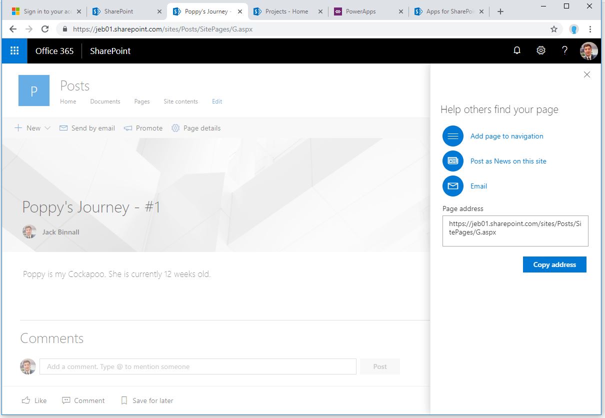
Fear not, if you create a page and want to promote that to news it can be done via the ‘Promote’ button or you will be prompted to add the page to the navigation, post as news on this site or email once the page is published.
Understand Page Templates
The modern page can have different layouts. At first when creating a Page you get prompted to choose a layout. The layout option does not appear when selecting a news post – this is one of the other slight variations between the two.
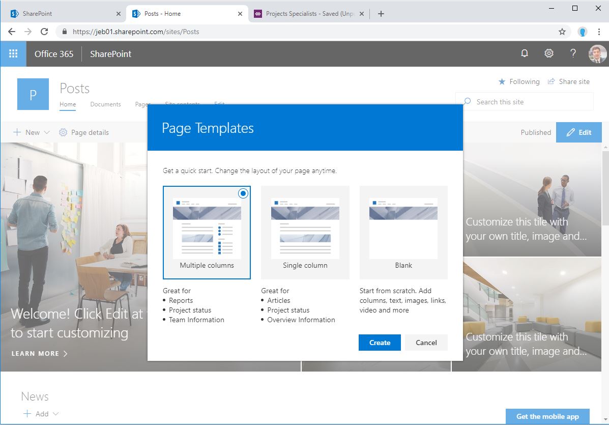
If you select a multiple column or single column template SharePoint will create the page with some boiler plate content. This boiler plate content may try to indicate what content would work best in that area.
Improvement: Microsoft could make the Page Templates available to news pages as well as site pages as a page can be promoted to news anyway.
SharePoint Page Canvas
But simply the SharePoint Page Canvas is the area in which you are allowed to customise in a SharePoint page.
The page canvas has three main ‘zones’.
- Title
- Sections
- Columns
Each of these zones make up the layout of the SharePoint page. It is important to understand how the different areas, especially the Sections and Columns area work together on the canvas.
Understanding the order of sections and columns is important because of the responsive nature of the page.
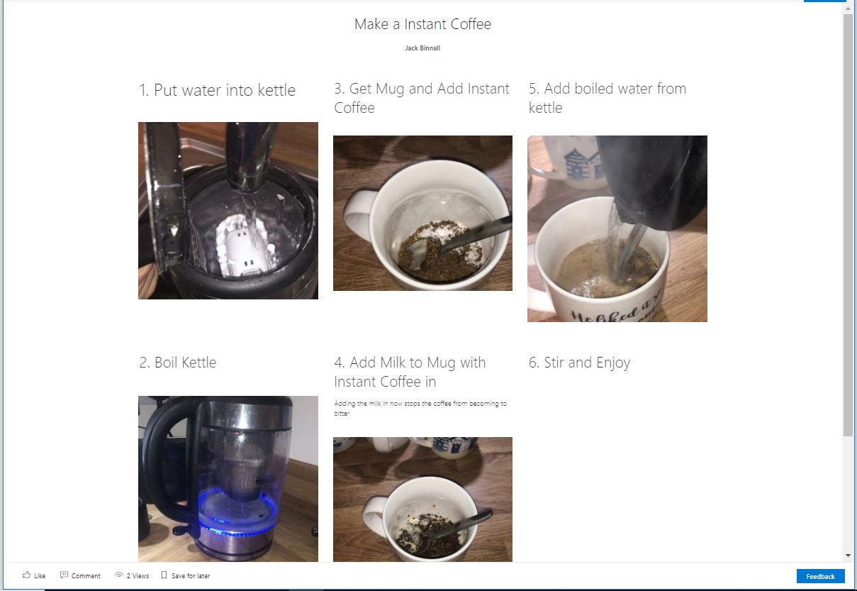
Canvas 1 is an image of a SharePoint Page that has been designed using images and text. In the desktop view the page looks and reads ok and the order in which the page flows is ok. However, when the resolution of the page has to change to display on a mobile device the page doesn’t flow as you’d expect.
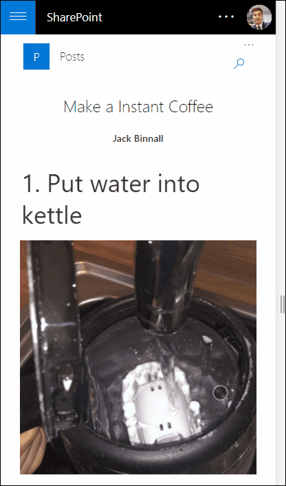
When the page moves into a smaller resolution it will to start to resize the content and reduce the widths of each column. However, if the resolution becomes to small the content will start to stack. This stacking of content is much more mobile friendly as it allows for a more natural vertical scroll. Unfortunately, because the page has been designed poorly in the modern canvas the stacking doesn’t flow in the correct way as seen in canvas 2.
Canvas 3 shows the page in edit mode. Background colour has been added to highlight that the page has been created across two sections with three sections.
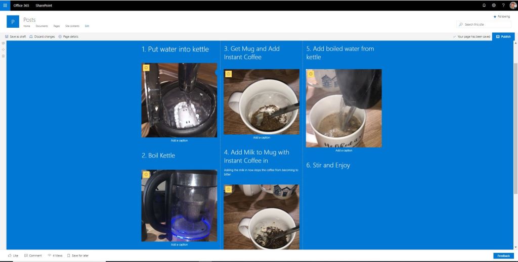
The reason for this stacking is because the page has been created with multiple sections and columns. The correct way to complete this would be to have one section with three columns and two web parts in each of the columns. Canvas 4 shows the page in edit mode with a single section. Canvas 5 shows the mobile view of the page with one section and three columns.
Mix up the Web Part Use
Different web parts have different ways of displaying the same content. A key example of this is the difference in which a Hero, Image and Image Stack web part display images.
The use of different web parts can dramatically shift the feel of a page. Take for example the three pages below, all displaying the same content but using different web parts for that content.
